Showing posts with label background. Show all posts
Showing posts with label background. Show all posts
Sunday, October 24, 2010
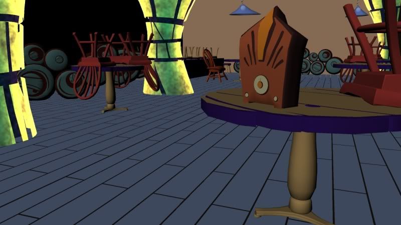
The set
Moving onto modeling the set now. I think it goes pretty well. Just wanted to show a sneak peek


Tuesday, June 1, 2010
3 Moods
Heyo, Nate again, checking in with some additional concept paintings for All In. We decided to come up with concepts expressing the moods 'Tension' and 'Retribution.' After some discussion we thought a good tactic would be to vary the color palette to express the changes in mood, but keep the continuity of location. Here is what we came up with:

TENSION

RETRIBUTION
The characters were added in with significant less texture and the addition of outlines, to separate. them from the environment. Here are the same pieces, sans characters:


Overall I'm very happy with the final product and I'm excited to translate this place into 3D! See you guys next school year! ~Nate
TENSION
RETRIBUTION
The characters were added in with significant less texture and the addition of outlines, to separate. them from the environment. Here are the same pieces, sans characters:
Overall I'm very happy with the final product and I'm excited to translate this place into 3D! See you guys next school year! ~Nate
Monday, May 3, 2010
Initial Concept Painting
Nate again, back with a concept painting!:

After chatting with Xuco, I think this style combines the graphic nature of his inspiration with the gritty feeling of a speakeasy. Xuco had said he didn't like the gradients in the art deco he showed me, so instead of that I decided to just use lots of different textures over clean-cut shapes, almost like cut paper. I'm quite happy with the effect and Xuco seems to like it too. Stay tuned for more work!
After chatting with Xuco, I think this style combines the graphic nature of his inspiration with the gritty feeling of a speakeasy. Xuco had said he didn't like the gradients in the art deco he showed me, so instead of that I decided to just use lots of different textures over clean-cut shapes, almost like cut paper. I'm quite happy with the effect and Xuco seems to like it too. Stay tuned for more work!
Saturday, May 1, 2010
Style Sketches
This is the aformentioned Nate, posting my first round of sketches for Sleazy Speakeasy. Yaay!
Xuco showed me his art deco influences and let me know that he is looking for something graphic but with depth, sort of like the Multi-plane camera used in 2D Animation.
One of the biggest challenges is combining the clean, crisp shapes of art deco and graphic work with the grimy, seedy mood of a speakeasy. I wanted to know just how much texture Xuco wanted and where he was willing to stray from art deco:

My initial sketch, straying far from the deco look and using textures and perspective to create depth.

Going for a more paper-cutout look, also playing with negative space and light-sources to create shapes.

Trying out some stylized curved lines and patterns. I like the implied bottles to the left, as they feel very art deco to me.

Here I took out all texture and tried to use the poker card suits as the art deco graphic shapes. Just a direction we could head stylistically.
After showing Xuco he like elements in the first two sketches, particularly the second. He wants the environment to be composed of recognizable shapes, but still stand on its own as the object/place it represents. After some good back and forth chatting I'm now gonna try to make a cohesive design for the environment! I shall post my results soon~
Xuco showed me his art deco influences and let me know that he is looking for something graphic but with depth, sort of like the Multi-plane camera used in 2D Animation.
One of the biggest challenges is combining the clean, crisp shapes of art deco and graphic work with the grimy, seedy mood of a speakeasy. I wanted to know just how much texture Xuco wanted and where he was willing to stray from art deco:
My initial sketch, straying far from the deco look and using textures and perspective to create depth.
Going for a more paper-cutout look, also playing with negative space and light-sources to create shapes.
Trying out some stylized curved lines and patterns. I like the implied bottles to the left, as they feel very art deco to me.
Here I took out all texture and tried to use the poker card suits as the art deco graphic shapes. Just a direction we could head stylistically.
After showing Xuco he like elements in the first two sketches, particularly the second. He wants the environment to be composed of recognizable shapes, but still stand on its own as the object/place it represents. After some good back and forth chatting I'm now gonna try to make a cohesive design for the environment! I shall post my results soon~
Subscribe to:
Posts (Atom)